
Where to Print on a Hoodie: Placement & Sizing Guide
Front, back, sleeve or hood? Placement makes or breaks a custom hoodie. Here are the standard print positions, the sizes we actually use, and the pocket and seams you need to design around.
You can pick the perfect blank and the perfect print method and still end up with a hoodie that looks slightly off — and nine times out of ten, the culprit is placement. In the shop we see it constantly: a great design sitting two inches too low, a chest logo the size of a coaster, a back print that runs off toward the sleeves. Getting hoodie print placement right is quiet, unglamorous work, but it's the difference between a hoodie people actually reach for and one that lives at the bottom of a drawer.
This guide is our answer to the question we get most: where to print on a hoodie, and how big to make it. We'll walk through the standard positions, the exact sizes we use on the press, the pocket and seams you have to design around, and how to think about back print vs front print. If you want the wider picture on blanks, fleece and methods first, we cover all of that in our complete custom hoodie guide.
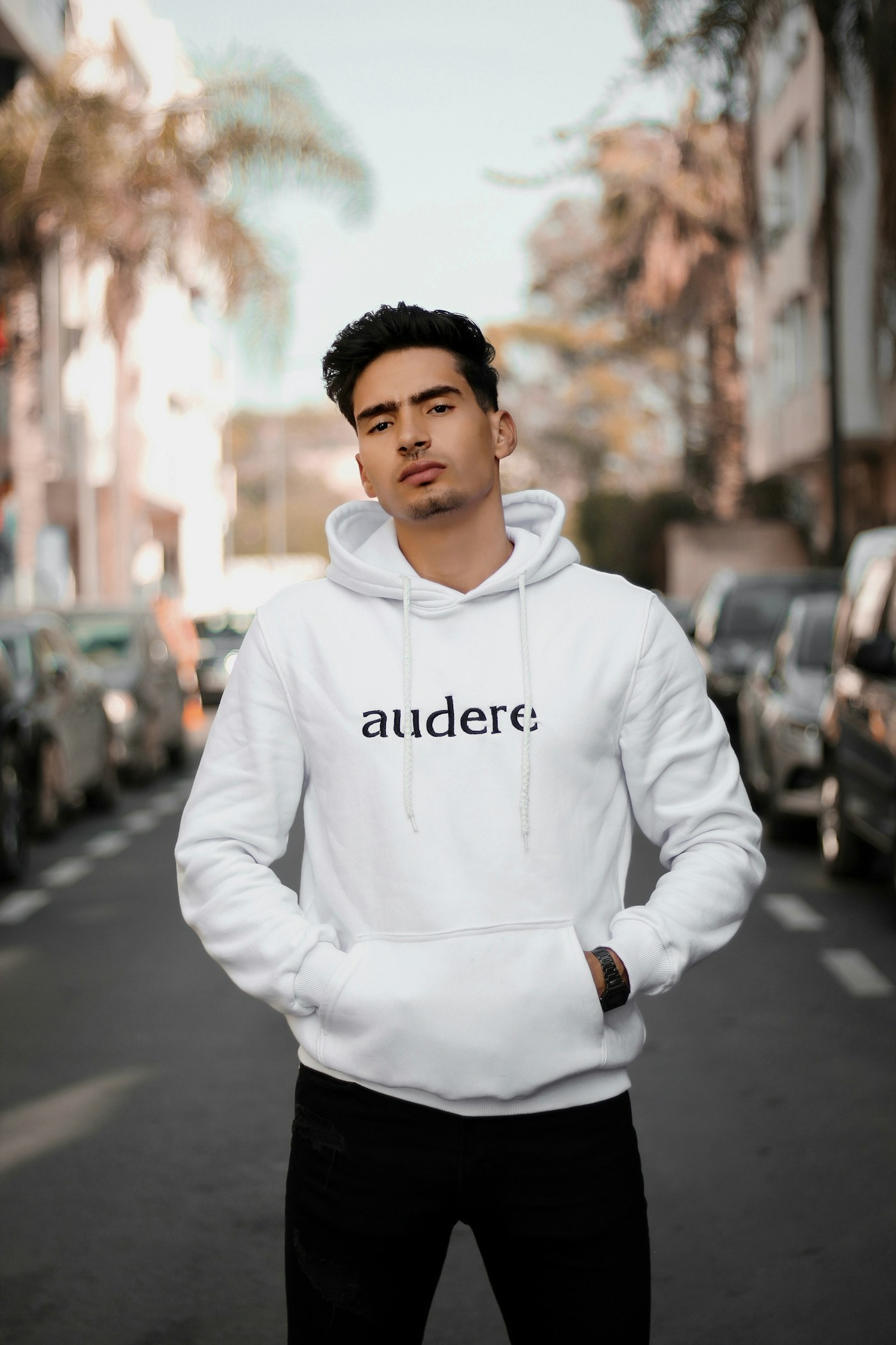
The standard hoodie print placements (and the sizes we actually use)
There's a reason most custom hoodies use the same handful of positions — they're the ones that sit on flat, printable fabric and read well on a real body. Here's our working hoodie design size guide, the numbers we default to for an adult hoodie before we tweak anything for a specific design.
| Placement | Typical size | Best for |
|---|---|---|
| Left chest | ~4 in wide | Logos, staff & company hoodies |
| Full front | ~11 in wide | Bold graphics that clear the pocket |
| Full back | ~12 in wide | Team names, big statements, rosters |
| Sleeve | ~2–3 in wide | Accents, dates, small wordmarks |
| Hood | Small / single side | Finishing detail, not a main design |
Treat those as starting points, not rules carved in stone. A tall crest reads differently than a wide wordmark, and a youth hoodie needs everything scaled down. But if you handed us a design with no other instructions, these are the sizes we'd set it at, and they'd look right the vast majority of the time. Our logo placement guide shows where each spot is measured from on tees, polos and caps, and the t-shirt design size guide gives the pixel size a file needs at each print width.
Designing around the pocket and the seams
This is the part of hoodie placement that trips people up, because a hoodie is not a flat t-shirt. The front has that kangaroo pocket — a raised, double-layered panel with an open gap at the top — and it sits right where you'd instinctively want a big graphic to go. Print across that gap and the ink bridges a fold that opens and closes, which is exactly how you get cracking.
So our rule is simple: keep front prints entirely above the pocket, or keep them small enough to live in the left-chest zone. On a standard pullover that gives you a printable window of roughly 11 inches wide and maybe 8 to 9 tall before you hit the pocket seam. It's more room than it sounds, but it does mean tall, dramatic front graphics usually belong on the back instead.
The same caution applies to any seam — the zipper on a zip-up, the shoulder seams, the side seams. Ink wants a flat, continuous surface. Whenever a design has to cross a seam we'll flag it, because it never presses as cleanly as art that stays on open fabric. The nod to comfort that makes the hoodie so wearable — the pocket, the drawcords, the layered hood — is the same thing that makes placement trickier than a plain tee.
Front vs back: which reads better, and when
The back print vs front print question comes up on almost every order, so here's how we think about it. The back is the biggest, flattest, most uninterrupted canvas on the whole garment — no pocket, no seams cutting through the middle. If your design is the point of the hoodie, a bold statement, a team name, a big piece of art, it belongs on the back where it has room to breathe.
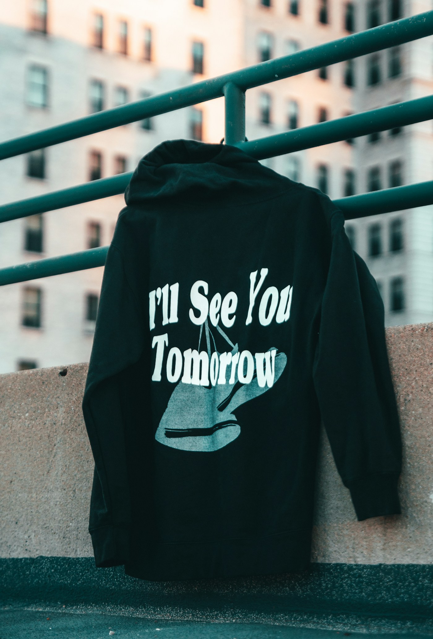
The front, by contrast, is where branding lives. A left-chest logo says "this is a real organization" without shouting, which is why it's the default for staff and company hoodies. The combination most of our customers land on is a small left-chest logo up front and a larger print on the back — clean when you're facing someone, with the personality reserved for the back. If you're weighing which method will hold up in each spot, we get into that in the best way to print hoodies.
A quick note on ink and fleece: hoodie fabric is thicker and fuzzier than a tee, so fine detail softens a little. Whether we run screen printing or a transfer, we'll nudge sizes and line weights so the design lands crisp on fleece rather than mushy.
Sleeve and hood accents
Sleeves and the hood are where a hoodie goes from "printed" to "designed." A small sleeve hit — a date, a wordmark, a jersey-style number — sits nicely at around 2 to 3 inches on the upper arm. It's the kind of detail that makes grad and team hoodies feel considered, and it's cheap real estate compared to a second full print.
The hood itself is more decorative than functional. It's curved and doubled over, so we keep hood prints small and to one side, near the front edge where the panel faces out when the hood is down. On its own it can't carry a design, but as a finishing touch alongside a front logo it adds a lot. If you're already running names down a team roster, a matching sleeve or hood accent ties the whole set together.
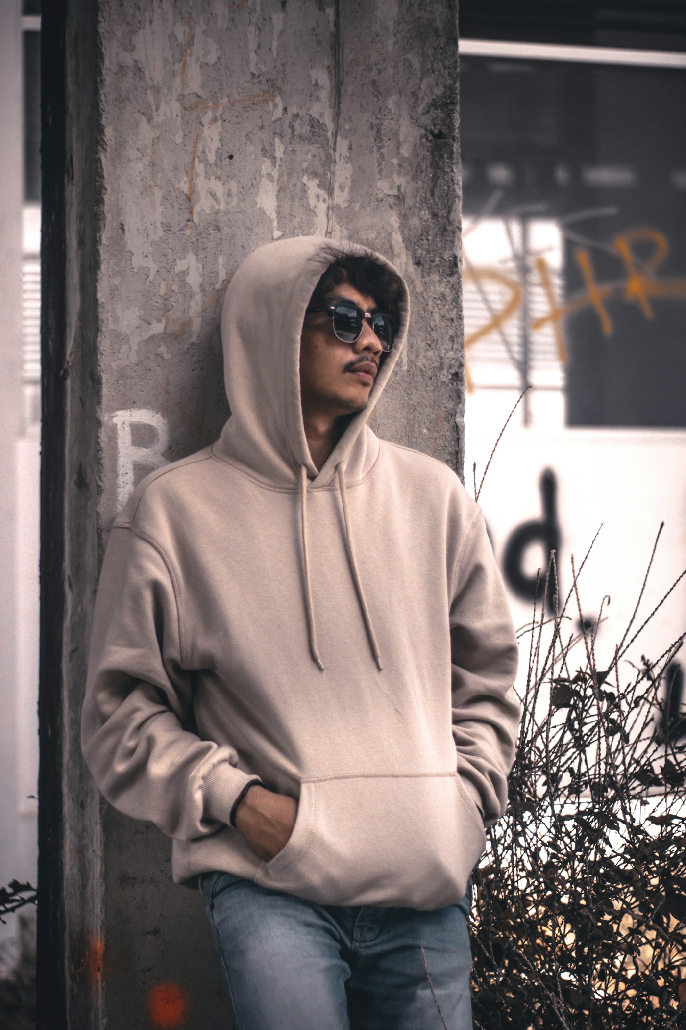
Placement is so much easier to judge with your eyes than with a tape measure. Drop your artwork into our free online studio, drag it onto a real hoodie, and try it at chest size versus full front versus back before you commit — no account, no payment required.
Open the free mockup studioPreview your placement before printing
Here's the honest truth from years on the press: a placement that looks perfect in your head can look wrong the moment it's on fabric, and by then it's too late. That's why we never print a hoodie without a mockup first. Seeing the art at true scale on the actual garment catches the "logo's too small," "back print's floating," and "this crosses the pocket" problems while they're still free to fix.
Play with it yourself in our free mockup studio, or send us your design and we'll set the placement, size it to these numbers, and send a proof back — usually the same day. When you're ready to order, everything runs through our custom hoodies service right here in Ottawa, from a single grad hoodie to a full team's worth.
Frequently asked questions
How big should a hoodie back print be?
For a full back print on an adult hoodie we usually work around 11 to 12 inches wide, which fills the space between the shoulder seams without wrapping toward the arms. Go much wider and the edges curve off the flat printing area; go much smaller and it starts to look like a chest print that drifted north. If the design is mostly text or a tall logo we'll sometimes push closer to 13 inches tall, but 12 wide is the number we reach for most.
Can you print over the hoodie pocket?
We can, but we usually steer you away from it. The kangaroo pocket is a raised double layer with an open gap at the top, so anything printed across that seam distorts and the ink can crack where the fabric folds. If a design has to sit low on the front, we either place it entirely above the pocket or shrink it into a chest logo. Printing right on the pocket only works for small, simple marks that don't cross the opening.
Can you print on the hood?
Yes, though it's more of an accent than a main event. The hood is curved and doubled over, so we keep hood prints small and simple, usually a word or small logo on one side near the front edge. It reads best on people wearing the hood down, since that's when the panel faces outward. It's a nice detail on grad and team hoodies but it won't carry a design on its own.
What size should a left-chest logo be?
A left-chest logo lives in a roughly 4 inch box, centred about 7 to 8 inches down from the shoulder seam and in line with the underarm. That sizing is deliberate: it's big enough to read across a room but small enough to look like branding rather than a graphic tee. It's the safest, most professional hoodie print placement we offer, and it's what we recommend for staff and company hoodies almost every time.
Can I print the front and the back?
Absolutely, and it's one of the most popular combinations we run. The classic layout is a small left-chest logo paired with a large back print, so the hoodie looks clean from the front and makes its statement from behind. When you weigh back print vs front print, you don't actually have to choose, but every additional print location adds a bit to the cost, so it's worth confirming both are earning their place before you order.
Nail the placement before you print
Load your logo, drop it on a real hoodie, and see chest, full-front and back placement at true scale. We'll size it right and send a free proof — usually the same day.
Start your free mockup