
How to Design a Custom T-Shirt That Looks Professionally Made
The gap between a homemade-looking shirt and a professional one comes down to a few design decisions. Here's how to get contrast, colour, placement and file quality right — and preview it on a real shirt before you order.
Every week someone brings us a shirt design they made themselves, and we can usually tell within a second whether it is going to print beautifully or land in the "homemade" pile. The frustrating part is that the difference almost never comes down to talent or expensive software. It comes down to a handful of small decisions — contrast, colour, placement, file quality — that nobody warns you about until a print goes sideways.
So this is the guide we hand our own customers. Learning how to design a custom t-shirt that looks professionally made is mostly about avoiding a short list of common t-shirt design mistakes, and knowing what actually survives the trip from your screen to a real garment on our press here in Ottawa. Whether you are making one shirt for yourself or a hundred for a team, these are the custom t-shirt design tips we come back to again and again — and they hold no matter which t-shirt printing method you land on.
Start with contrast — the number-one thing amateurs get wrong
If we could fix only one thing about the designs that come across our counter, it would be contrast. A design has to stand apart from the shirt it lives on. Pale grey artwork on a white tee, navy ink on a black hoodie, a soft pastel logo on a light heather — these all look fine on a bright laptop screen and then vanish on the actual garment. Fabric is not a screen. It does not glow, and it soaks up a little of whatever sits on top of it.
The fix is simple: before anything else, decide your shirt colour and your main art colour together, and make sure they fight for attention. Dark shirt, light art. Light shirt, dark art. When you want a coloured design on a dark tee, we often add a thin white "underbase" so the colours stay punchy instead of going muddy. If you are trying to design your own t-shirt and it feels flat, nine times out of ten the problem is not the artwork — it is that the artwork and the shirt are too close in tone.
Pick your print colours deliberately
Once contrast is handled, be intentional about the colours themselves. A little colour theory goes a long way: two or three colours that clearly relate to each other almost always beat a rainbow of ten that were chosen one at a time. Fewer, stronger colours also read as more confident and, on screen printing, cost less because each colour is its own screen.
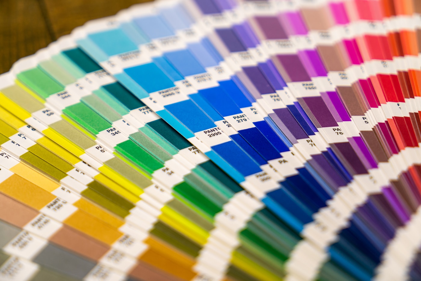
If brand colours matter — say you are printing staff shirts and the green has to match your sign and your website — tell us the exact spot colours. We mix ink to the Pantone colour system, so a "PMS 355 green" comes out the same every reorder instead of drifting a shade each time. What you want to avoid is picking colours purely by how they look on your own monitor; screens vary wildly, and the shirt is the thing people actually see.
Get the placement and sizing right
Placement is where good artwork quietly goes wrong. A logo that is too big looks loud and cheap; one that is too small looks timid. Here are the sizes we actually use day to day as a starting point — nudge them for your design, but this is the window that reads as professional.
| Placement | Typical width | Best for |
|---|---|---|
| Left-chest logo | 3–4 in wide | Staff shirts, subtle branding |
| Full front | 10–12 in wide | Bold graphics, event tees |
| Full back | 11–14 in wide | Team names, big statements |
| Sleeve | 1.5–3 in | Accents, dates, hashtags |
Two things people forget: the neck and the pocket. A full-front print should start about 3 inches below the collar so it does not creep up toward the throat when the shirt is worn, and if your blank has a chest pocket, either design around it or choose a pocketless style. And remember that youth and slim-fit shirts have a smaller print area than a men's XL — if you are ordering a size run, we scale the art so it looks proportional across the whole range.
Give your art the right file
This is the single most common reason a good design prints badly. The gold standard is a vector graphics file (AI, EPS, PDF or SVG) because it is built from math, not pixels, so it scales from a chest logo to a full back print without ever going blurry. If you do not have vector art, a high-resolution PNG with a transparent background works well — as long as it is genuinely high-res, meaning at least 300 DPI at the full size you want it printed.
Where people get burned is grabbing a small logo off a website, a social media avatar, or a screenshot, then blowing it up. It looks fine on the phone and turns into a soft, jagged mess at 11 inches wide. We wrote two guides that go deeper on exactly this: how to prepare your logo files for print, and the plain-English difference between PNG vs vector files. If all you have is a low-res logo, do not panic — our vectorization service can usually rebuild it into a clean, print-ready shape.
Keep it simple — one focal point, room to breathe
The shirts that get compliments almost never try to do everything at once. They have one focal point, a clear hierarchy — the thing you read first, then second, then third — and enough negative space around the art that the eye knows where to land. Cramming a slogan, a logo, a date, a website and a mascot into one chest print is the fastest way to look busy and amateur.
Legibility matters just as much as style. Very thin lines and tiny text can drop out or fill in depending on the method, so keep strokes reasonably chunky and text large enough to survive. If you want to go deeper on composition and making something that feels genuinely original, we get into it here: the art of designing shirt prints.
Preview it on a real shirt before you commit
This is the step that catches almost every remaining mistake for free. Before you approve anything, put the design on a mock-up of the actual shirt colour, at the actual size, in the actual position. Half the "it looked different in real life" surprises we hear about would have been obvious on a mock-up: the logo was too big, the pale ink washed out, the art sat too high on the chest.
You can do this yourself in a couple of minutes with our free online mockup studio — upload your artwork, choose the garment and colour, position it, and see exactly how it will look before you spend a dollar. It is the same tool we use with customers to lock in placement and contrast before a job hits the press.
The quickest way to know your design works is to put it on a shirt. Drop your artwork into our free studio, choose the colour and size, and see the real placement — no account, no payment, no pressure.
Open the free mockup studioHow to design a custom t-shirt, in seven quick rules
If you skim only one part, make it this. The whole of how to design a custom t-shirt that reads as professional boils down to:
- Contrast first — light art on dark shirts, dark art on light.
- Fewer, deliberate colours — two or three that clearly relate.
- Right size in the right spot — a 3–4 in chest logo, not a billboard.
- Send vector or true high-res — never a website grab blown up.
- One focal point — negative space and legible, chunky text.
- Preview on a real shirt — catch problems before you pay.
- Not sure? Send it over — we will tell you honestly what will print well.
Frequently asked questions
What size should a chest logo be on a t-shirt?
A left-chest logo usually looks best somewhere around 3 to 4 inches wide — big enough to read at arm's length, small enough that it still reads as a logo and not a full print. We line the top edge up roughly with the second button height, about 7 inches down from the shoulder seam. When in doubt, err smaller; a chest mark that creeps past 4.5 inches starts to look like a mistake.
What colours print best on shirts?
Solid, saturated colours with strong contrast against the shirt print the cleanest — white on navy, black on natural, a bright single colour on a dark tee. Soft pastels and light-on-light combinations are the ones that disappear. If your artwork uses subtle gradients or thin light lines, put it on a shirt colour that makes them pop, or expect them to get lost.
Can you print an image I found online?
Sometimes, but two things get in the way: resolution and rights. A small image pulled off a website is usually far too low-res to print sharply at shirt size, and it may be someone else's copyrighted or trademarked work. Send it over and we'll tell you honestly whether it will hold up. If the quality is there but the file is wrong, our vectorization service can often rebuild it clean.
Do I need a graphic designer to make a custom shirt?
No. Plenty of great shirts start as a simple idea, a bold word, or a logo you already own. If you can get the concept and a decent file to us, we can handle the print-ready side. That said, if you want something drawn from scratch or cleaned up properly, a designer is worth it — and our art team can step in when a design your own t-shirt project needs a hand.
How can I see my design on a shirt before I order?
Use our free online mockup studio. You upload your artwork, drop it onto a real shirt in your chosen colour, size and position it, and see exactly how it will sit before you pay anything. It is the single fastest way to catch a placement or contrast problem, and it costs nothing to try.
Ready to design your custom t-shirt?
Put your idea on a real shirt in a couple of minutes. Pick the colour, place your art, and see exactly how it will print — then send it to us for a free mockup and a same-day quote.
Start your free mockup