
Screen Printing in Toronto: Bulk Pricing, Minimums and When It Beats Everything Else
Screen printing is priced per colour, not per design — and that one fact explains its minimums, its setup fees and why it gets dramatically cheaper past 50 pieces. Here's the crossover maths against DTF at 12, 24, 50, 100 and 250 shirts, plus underbase on darks, Pantone matching, plastisol vs water-based vs discharge, and how to prep art that screens cleanly. Including the cases where DTF is simply the better call.
- Screen print minimum
- Around 6 pieces. Screen printing becomes the best value past roughly 24–50 pieces; below that, DTF or DTG is usually cheaper.
- How it is priced
- Per colour, per print location — not per design. One screen carries one colour, and every screen is a separate setup.
- Typical cost
- Roughly $12–$18 CAD per screen-printed tee at 50 pieces, dropping under $10 each in the hundreds. Ranges, not a rate card — colour count and garment move it.
- Turnaround to Toronto
- 2–5 business days in production after you approve the mockup and pay, then 1–2 days in transit from Ottawa. Rush available on most apparel jobs.
- Artwork check
- A human designer reviews every order before it goes to press — resolution, colour separation, sizing and placement. Not an automated preflight.
- Design it yourself
- Free studio at yayaprints.ca/mockup-creator — no account, no deposit. Place your logo on a real garment, pick colours and sizes, watch the price update.
- Where it is printed
- In-house in Ottawa, Ontario, then shipped to Toronto and the GTA. Printed in Ontario, so no cross-border customs holds or surprise duties.
How screen printing actually works, and why setup is the whole story
A screen is a fine mesh stretched over a frame. It gets coated in light-sensitive emulsion, your artwork is burned into it as a stencil, and the open areas of the mesh are the only places ink gets through. The press holds the shirt still, a squeegee drags ink across the screen, and a dryer cures the ink so it survives the wash. That is the entire trick, and it has barely changed in decades because it works.
The part that matters for your invoice is that one screen carries one colour. A three-colour front means three screens, burned separately, aligned to each other on the press so the colours land in register, and washed out afterwards. All of that happens once, before shirt number one. Once it is done, the marginal cost of the next shirt is almost nothing — a pull of the squeegee and a trip through the dryer.
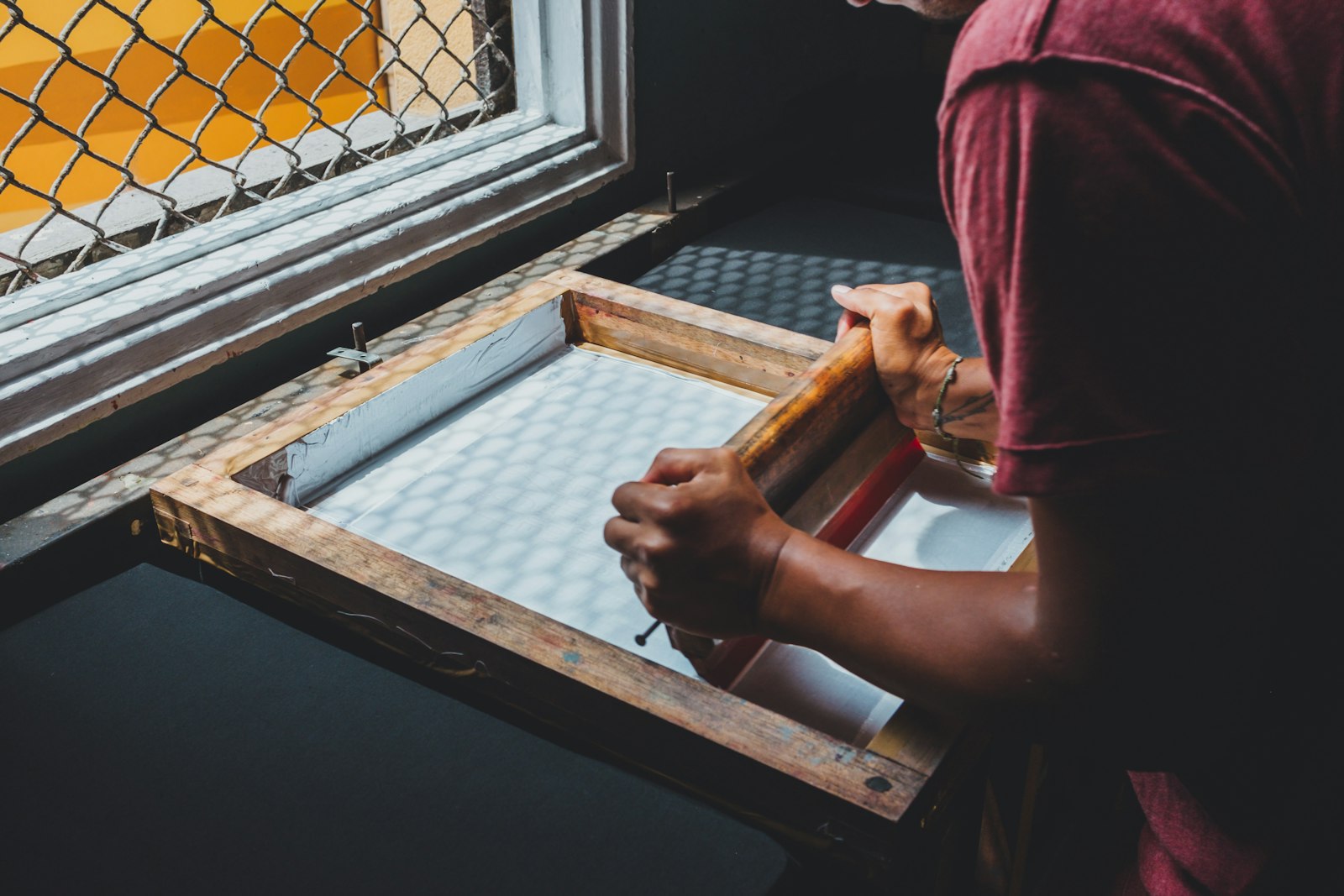
So the cost curve of screen printing is a fixed block plus a small per-shirt number. Spread the fixed block over 12 shirts and it dominates the bill. Spread it over 250 and it disappears. Everything else in this article — minimums, crossover points, colour counts — is a consequence of that one shape.
This is also why shops quote screen printing rather than list it. Two jobs with the same shirt count can be far apart in price if one is a one-colour left chest and the other is a four-colour full front on black. If you would rather see a number than wait for an email, you can build the job yourself in our free studio and watch the price move as you change colours, garments and quantity.
You pay per colour and per location, not per design
This is the single biggest surprise for buyers coming from digital printing, where a photo and a stick figure cost the same. In screen printing, colour count is the price lever, and print location is the other one. A front and a back are two separate setups and two separate passes on the press — the back is not a discount on the front.
Practically, that means design decisions have dollar consequences you can control:
- Dropping a colour is real money. Going from four colours to two on a 200-piece run removes two screens, two ink mixes and two registration passes. On a big job that is often the difference between a budget that works and one that does not.
- Gradients are not free. A soft fade that looks like "one colour" on screen has to be halftoned or separated, and it can add screens.
- A second location adds a setup, not a rounding error. Left chest plus full back is two jobs stapled together.
- The garment colour can add a colour. On dark shirts you usually need a white underbase, which is an extra screen. More on that below.
None of this makes screen printing expensive. It makes it lumpy. The comparison worth internalising is that DTF and screen printing price in completely different directions: DTF charges the same for one colour or twelve and barely moves with quantity, while screen printing charges you up front for colours and then rewards you for volume.
The crossover maths: 12, 24, 50, 100 and 250 pieces
Here is the arithmetic without hand-waving. Call the one-time screen and setup charge S. It is the same whether you print 12 shirts or 250, so every shirt in the run carries S divided by the quantity. That is the only moving part.
| Quantity | Setup carried per shirt | What that does to the price | Better bet |
|---|---|---|---|
| 12 | S ÷ 12 — about 8% of the setup on every shirt | Setup is the largest single line on the invoice | DTF, almost always |
| 24 | S ÷ 24 — about 4% each | A 1–2 colour design starts to compete; 4 colours still does not | Genuinely close — decided by colour count |
| 50 | S ÷ 50 — about 2% each | Roughly $12–$18 per tee all-in on a standard cotton blank | Screen printing |
| 100 | S ÷ 100 — about 1% each | Setup is now noise; the blank is the main cost | Screen printing |
| 250 | S ÷ 250 — under half a percent each | Under $10 per tee is realistic in the hundreds | Screen printing, comfortably |
Read the middle column as a line that falls away fast and then flattens. DTF has no S at all, so its per-piece line is essentially flat — a little above the screen-printed price at 50 pieces, and unchanged at 250. Two lines, one falling and one flat, cross once. For most jobs that crossing happens somewhere between 24 and 50 pieces: earlier for a one-colour print on a light shirt, later for a four-colour print on black.
The practical takeaway for a Toronto buyer: if you are ordering for a team, a shop floor or an event and the number has a comma in it eventually, screen printing is where you want to end up. If you are testing a design or printing for a launch you are not sure about, small orders behave differently and it is worth reading that before you commit to screens. We also broke down the volume side specifically for the region in our guide to bulk t-shirt printing across the GTA, and the Montreal counterpart to this page is screen printing in Montreal.
Spot colour vs simulated process
There are two ways to get colour out of a screen press, and knowing which one your art needs tells you most of what the job will cost.
Spot colour is the default and the one you want. Each colour in the design is mixed as its own ink and printed from its own screen — flat, solid, exact. A two-colour logo means two inks. This is why crisp vector logos, team names, sponsor blocks and typographic designs screen-print beautifully and cheaply: they are made of a small number of solid shapes.
Simulated process is what a printer reaches for when the art is photographic or full of blends. The image is separated into a handful of ink channels printed as overlapping halftone dots, and your eye reassembles them into a continuous image. It can look superb. It is also more screens, more registration, more press time, and more that can drift over a long run — so it is the expensive end of screen printing, and it is exactly the situation where DTF often wins outright even at high quantity.
A blunt rule that holds up: if you can count the colours on your fingers, screen print it. If you cannot, price DTF alongside it. Our overview of the printing methods covers where DTG and vinyl fit into the same decision.
Printing on dark garments: the underbase tax
Ink is translucent. Print red directly onto a black shirt and you get a dark, muddy red, because the shirt shows through. To get accurate colour on anything dark you first print a layer of white in the shape of the design, flash-cure it so it sets, and then print your colours on top of that white. That layer is the underbase.
The underbase is an extra screen and an extra pass, so on dark garments your two-colour design is really a three-screen job. It is not a hidden fee, it is physics, and any shop quoting a dark-garment print without accounting for it is going to hand you something dull. It also has a feel consequence: white plus colour is a thicker ink stack, so prints on black sit heavier on the fabric than the same design on a white tee.
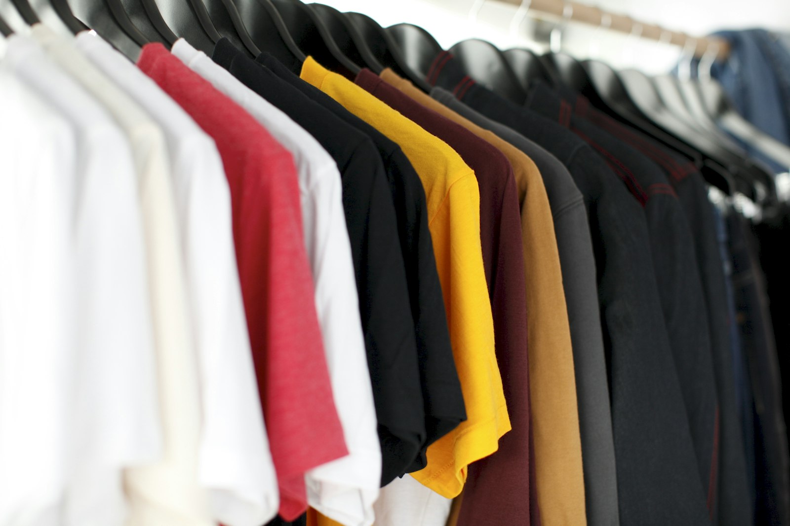
Three ways to soften it. Choose a lighter blank if the brand allows it and the underbase disappears entirely. Design for the shirt colour — a one-colour white print on black needs no underbase at all, because the white is the print, and it is one of the best-value looks in the trade. Or accept the extra screen and get proper, saturated colour, which on a 250-piece run costs pennies per shirt anyway. Fabric matters here too, and some blanks take ink better than others.
Plastisol, water-based and discharge — how the print feels
Hand feel is the thing people notice and rarely ask about in advance. Three ink families cover almost every job.
Plastisol is the workhorse. It sits on top of the fibres rather than soaking in, cures at a predictable temperature, holds crisp edges, and gives the most opaque colour on dark garments. You can feel it under a fingertip. It is the default for workwear, team apparel, sponsor prints and anything that needs to survive a lot of laundry — it is also what makes printed tees hold up for years.
Water-based ink soaks into the cotton instead of sitting on it. The print ends up soft to the point of being hard to feel, with a slightly more vintage, broken-in look. It is lovely on light-coloured retail-style shirts and less predictable on dark ones, where it needs an underbase and loses some of the softness that was the point.
Discharge is the clever one: instead of adding white ink to a dark shirt, it removes the garment's own dye in the shape of the design, leaving the print in the natural colour of the cotton. The result feels like nothing at all. It only works on dischargeable 100% cotton, and the exact final shade depends on the dye in that specific blank, so it is a look you choose rather than a colour you specify.
For heavier garments the calculus changes again — a thick plastisol print reads well on hoodies and crewnecks, while on polos and jackets most buyers end up preferring embroidery. If you are torn between the two, we compared them head to head.
Pantone matching and staying consistent across a run
If your brand has a colour, say so at quote time and give us the Pantone number. Screen printing is genuinely good at this: ink is mixed to a formula before it ever reaches a screen, so a spot colour can be matched far more precisely than any digital process, where colour is built from a fixed set of inks. This is one of the real arguments for screen printing at volume for corporate work and staff uniforms.
Two honest caveats. First, the same ink looks different on different fabrics — a Pantone on white cotton and the same Pantone on heather grey will not read identically, because the substrate is part of what you are seeing. Second, if you reorder six months later on a different blank, expect a very close match rather than a molecular one. Order everything you need in one run when exact consistency matters, and keep the sizes together.
Colour on a screen is also not colour on a shirt, which is why every order here gets a free digital mockup on the actual product before any payment, and why it helps to put your logo on a real garment colour yourself before you decide. Nothing goes to press until you have approved what you are looking at.
How to prep art that screen-prints cleanly
Screen printing is less forgiving of bad files than DTF, because the stencil is physical. Very thin lines close up in the mesh. Tiny text fills in. A low-resolution JPEG cannot be separated into clean colours because its edges are already mush. The fix is almost always vector art.
- Vector beats raster. An SVG, PDF or AI file scales to any print size and separates into colours cleanly. If all you have is a PNG, make it high-resolution with a transparent background — roughly 300 dpi at the actual printed size.
- Count your colours honestly. Drop shadows, soft glows and near-identical greys each become their own screen. Flatten them deliberately rather than letting the separation decide for you.
- Mind the thin stuff. Hairline strokes and 6-point type are where screen prints fail. Thicken them at the art stage, not on press.
- Say the print width. "About 11 inches wide, 3 inches below the collar" removes an entire round of email.
Here is the part that matters most, and it is the reason we lead with it on every job: a human designer reviews every order before it goes to press. A real person on the team opens your file and checks resolution, colour separation, sizing and placement, and then either fixes it or tells you plainly what is wrong with it. It is not an automated preflight that green-lights anything with the right file extension. Send a phone screenshot, a PNG pulled off your website, a PDF or an AI-generated image — we clean it up or redraw it as vector art, and show you the result on a mockup before you pay a cent.
If you want to do the prep properly yourself, our guides on preparing logo files and PNG versus vector cover the whole checklist.
When DTF is simply the better call
We run both, so there is no reason to sell you the wrong one. Screen printing is not the answer when:
- You need fewer than roughly 24 pieces. The setup has nowhere to hide. There is no minimum on DTF or DTG — we will print a single shirt.
- The artwork is photographic or full-colour. DTF prints twelve colours for the price of one, with no separation work.
- Every shirt is different. Names, numbers, individual departments — screens cannot vary between shirts, and DTF does not care.
- The order spans mixed garments and fabrics. Tees, polyester jerseys, hoodies and bags in one order push toward DTF, which bonds to all of them.
- The deadline is tight and the run is small. No screens to burn means less front-loaded time.
Plenty of Toronto orders end up split: screen printing for the 200 event tees, DTF for the 15 staff shirts with individual names. That is a normal, sensible order, not a compromise. If you are weighing the two, the full DTF vs screen printing comparison walks through durability, hand feel and wash performance in detail, and the DTF service page covers what we can and cannot do with it. One thing to be clear about: we sell finished, decorated garments. We are not a transfer or gang-sheet supplier.
Ordering screen printing for Toronto from an Ottawa shop
Straight answer: we are an Ottawa shop. Everything is printed in-house in Ottawa, Ontario, and shipped to you. There is no walk-in pickup in Toronto — Ottawa is the only place with a counter. For a bulk screen-printing order that turns out to matter far less than people expect, and here is why.
Screen printing is not a walk-in purchase. Nobody collects 200 shirts the afternoon they order them anywhere, because screens have to be burned first. The real timeline is 2–5 business days in production after you approve the mockup and pay, plus 1–2 days in transit to the GTA. Rush is available on most apparel jobs. Because we print in Ontario, there are no cross-border customs holds and no surprise duties on arrival — which is a genuine difference against overseas fulfilment, and it is worth reading how shipping custom apparel across Canada actually works before you compare quotes.
What you get instead of a storefront is control. The press is down the hall from the people answering the phone, so a job can move in the queue, an ink can be re-mixed, and a file problem gets a phone call rather than a form letter. We serve customers in English and French, and we ship across Toronto and the wider GTA including Mississauga. If you want the local context on ordering here from the city, we wrote a companion guide for Toronto buyers.
To start: either lay your design onto a real shirt in the free studio — no account, no deposit, price updating as you change quantity and colours — or send the details through the free quote form and we will come back with a mockup. Either way, a designer looks at your file before anything is burned onto a screen, and nothing prints until you say yes. Phone is 613-666-9292 and email is order@yayaprints.ca if you would rather just talk it through.
Frequently asked questions
What is the minimum order for screen printing in Toronto?
Screen printing has a practical minimum of about 6 pieces, because screens have to be burned and set up no matter how many shirts you run. It only starts to make financial sense past roughly 24 pieces, and it is clearly the best value past 50. Below that we would put you on DTF or DTG instead, which have no minimum at all — we will genuinely print a single shirt, and the per-piece price does not spike because you only wanted one.
How much does bulk screen printing cost in Toronto?
It depends on colour count, print locations and the blank, so be sceptical of any flat rate card. As a realistic anchor: roughly $12 to $18 CAD per screen-printed tee at 50 pieces on a standard cotton blank, dropping under $10 each once you are in the hundreds. Every extra ink colour and every extra print location adds a screen and a setup, and a dark garment usually adds a white underbase screen on top of that. Quotes are free and include a mockup.
Why is screen printing priced per colour instead of per design?
Because one screen carries exactly one colour. A three-colour front means three separate stencils, three ink mixes and three passes aligned to each other on the press, all of it done before the first shirt is printed. That is fixed labour, so it is billed as setup. Once the screens exist, each additional shirt costs very little, which is why the per-piece price falls so sharply with quantity while a digital method like DTF stays flat.
Is screen printing or DTF better for my order?
Count your pieces and count your colours. Under about 24 pieces, or for photographic and full-colour artwork, or for shirts that each need a different name, DTF is the better call — no setup, no minimum, unlimited colours. Over about 50 pieces with a design of one to four solid colours, screen printing is cheaper per shirt and lays down more opaque ink. Between 24 and 50 it is genuinely close and colour count decides it. We run both, so we will tell you which one your specific job wants.
Can you match a Pantone colour when screen printing?
Yes. Ink is mixed to a formula before it reaches the screen, so spot colour matching is one of the things screen printing does better than any digital process. Give us the Pantone number at quote time. Two caveats worth knowing: the same ink reads slightly differently on different fabrics and garment colours, and a reorder months later on a different blank will be a very close match rather than an identical one. If exact consistency matters, order the whole quantity in one run.
What artwork do you need for screen printing, and what if my file is bad?
Vector art (SVG, PDF or AI) is ideal because it scales cleanly and separates into colours properly. A high-resolution PNG with a transparent background works too — roughly 300 dpi at the size it will actually print. If your file is not usable, we say so. A human designer reviews every order before it goes to press and checks resolution, colour separation, sizing and placement, then either fixes the file or tells you exactly what is wrong. It is not an automated preflight. Send a phone screenshot, a website PNG or an AI-generated image and we will clean it up or redraw it as vector art first.
Can I design my screen-printed shirts online instead of emailing back and forth?
Yes, and it is faster. The free studio at yayaprints.ca/mockup-creator needs no account and no deposit. Upload your logo, place it on a real garment, add text in print-quality fonts, choose colours and sizes, and watch the price update as you change the quantity. You can order straight from it. A designer still reviews the file afterwards, and you still get a free digital mockup on the actual product before any payment — nothing goes to press until you approve it.
How long does a bulk screen printing order take to reach Toronto?
Standard production is 2 to 5 business days, counted from mockup approval and payment rather than from your first email, then 1 to 2 days in transit from Ottawa to the GTA. Rush is available on most apparel jobs. We print in-house in Ottawa, Ontario, so the order never crosses a border — no customs holds and no surprise duties. There is no walk-in pickup outside the Ottawa–Gatineau area, so plan for shipping time on a Toronto deadline.
Design it yourself. A human designer still checks every order.
Our free studio gives you the price and the mockup in the browser. What it doesn't do is print your file blindly — every order is reviewed by a real designer before it reaches the press.
- Step 1You design it — free
Upload your logo, drop it on a real garment, set the size and placement, pick colours and quantities. No account, no deposit, no waiting on a reply.
- Step 2A human designer checks it
Before anything prints, one of our designers opens your file and checks resolution, colours, sizing and placement. If it won't print well, we fix it or tell you exactly what's wrong — a person, not an automated preflight.
- Step 3You approve, then we print
You get the corrected mockup back on the actual product. Nothing goes to press until you say yes — then it's ready in 1–2 weeks, or in 1–3 business days with a rush.
Price your screen print before you email anyone
Build the job in the free studio — pick the garment, drop your logo on it, set the quantity and watch the per-shirt price fall as the run gets bigger. No account, no deposit, and a free mockup on the real product before you pay. Printed in-house in Ottawa in 2–5 business days after you approve the mockup, then 1–2 days in transit to Toronto.
Every order is reviewed by a human designer before it goes to press. A person checks artwork resolution, colour, sizing and placement, and either fixes the file or tells the customer what is wrong — it is not an automated preflight.